
Some more info over REX
Friday, April 23, 2010
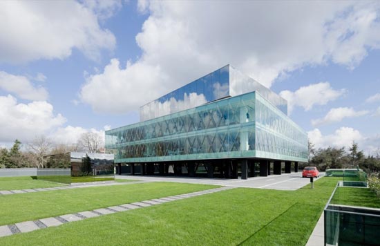
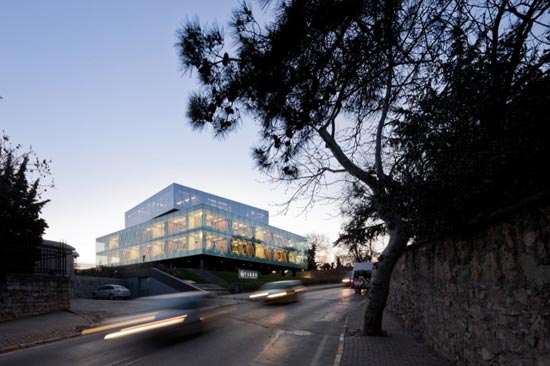
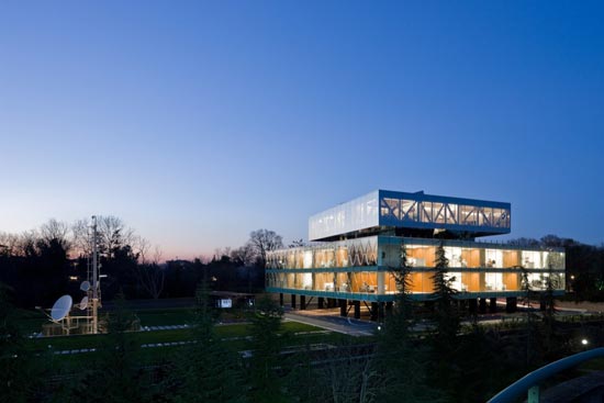
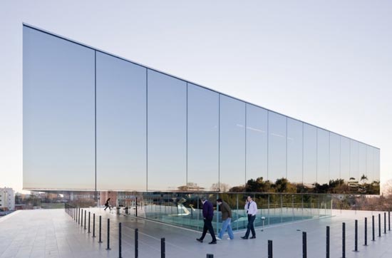
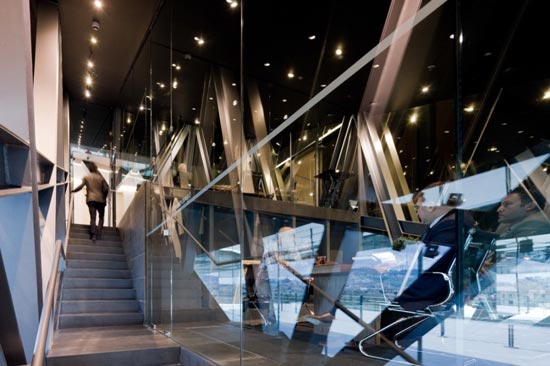
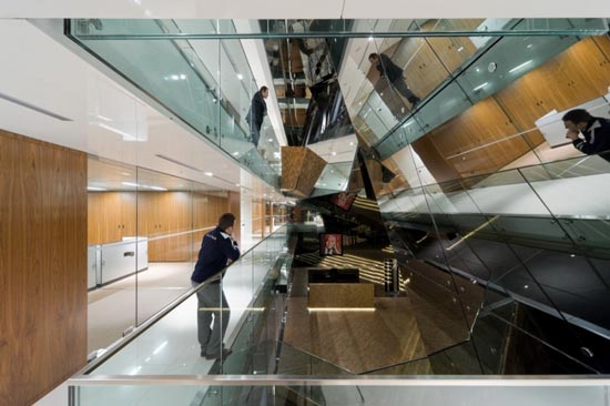
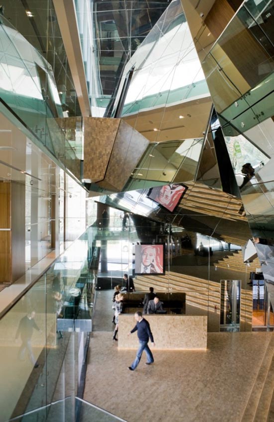
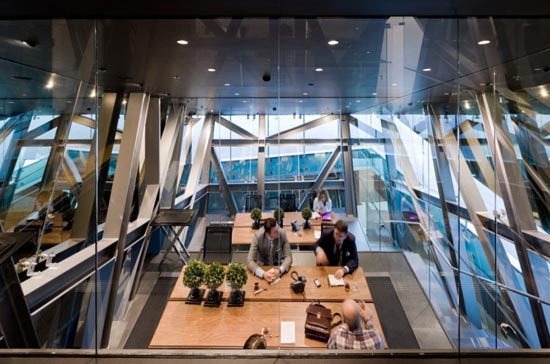
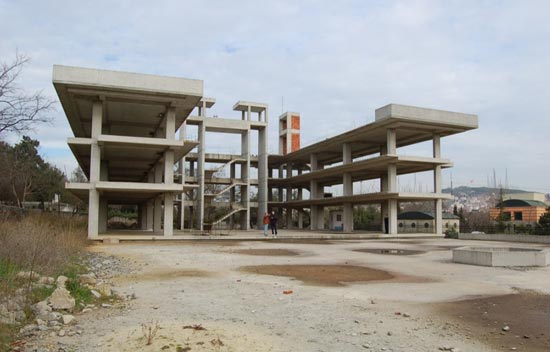
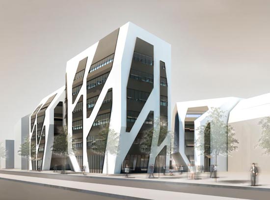
Vakko Headquarters and Power Media Center by REX
Some forward ideas over here. My favorite one is the use of reflexion and how the building emphasize the beams. Plus the interior is very dislocated but when viewed from the outside seems consistent and uniform. How they created voids is interesting too.
The most important issue is that the building it's built over an abandoned skeleton of an unfinished hotel project using and modifying plans from another canceled project in the united states, allowing construction to begin only four days after REX received the commission.


The structure of the unfinished hotel before REX:
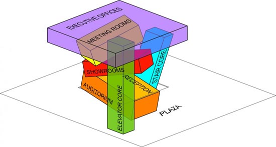
Program distribution:
REX Architecture
The most important issue is that the building it's built over an abandoned skeleton of an unfinished hotel project using and modifying plans from another canceled project in the united states, allowing construction to begin only four days after REX received the commission.
The structure of the unfinished hotel before REX:
Program distribution:
REX Architecture
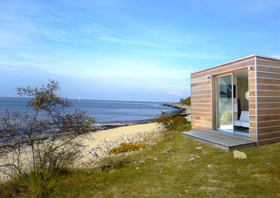
The Double Room - Portable Home by Global Homes
In my quest for Prefab Houses, Sleeping units and Container Architecture I came across with the next example. Which is not the best ever, but many mobile houses from my point of view are worse than this one.


I wish they had done a better job with the drawings as this sketchup image is indeed bad for their marketing (Also the images and photos don't explain much)...

Global Homes (be aware that they aren't exactly good with their marketing).
I wish they had done a better job with the drawings as this sketchup image is indeed bad for their marketing (Also the images and photos don't explain much)...
Global Homes (be aware that they aren't exactly good with their marketing).
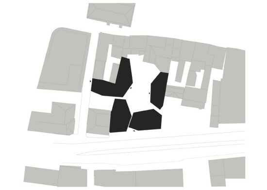
Sonnenhof by J.Mayer H. Architects
For me most of the time the good concepts and results seem to be more about integration than any other thing. Specially when you are trying to be bold and risky and go further into something new or unseen.
"the four-building complex leaves a large part of the space open for public use during the day, permitting a free flow of pedestrian traffic across the area. the buildings, situated on the edges of the lot, frame a small, urban courtyard typical to medieval city structures. passages between the individual
buildings connect them to the surrounding public-use areas, making it an important junction
in the urban network. the mixed-use concept supports a small scale, seamless integration into the existing urban fabric"
These buildings broke with the existing surroundings but at the same time they do integrate the already consolidated city... Something that already was working properly and it isn't in any need to be changed.
I often see projects that are a barrier to the existing site, I understand that many times you just want to give a knew dimension and change the playing rules of an area. But people tend to forget that architecture is not about messing everything up if there is not a need for it. And many architectural icons attract people but don't consolidate what is around them which is a pity (I have been having many discussions about icons and the cities, and how a bunch of icons by themselves don't create cities unless you are talking about Las Vegas and very few other examples).
"the four-building complex leaves a large part of the space open for public use during the day, permitting a free flow of pedestrian traffic across the area. the buildings, situated on the edges of the lot, frame a small, urban courtyard typical to medieval city structures. passages between the individual
buildings connect them to the surrounding public-use areas, making it an important junction
in the urban network. the mixed-use concept supports a small scale, seamless integration into the existing urban fabric"


Thursday, April 22, 2010
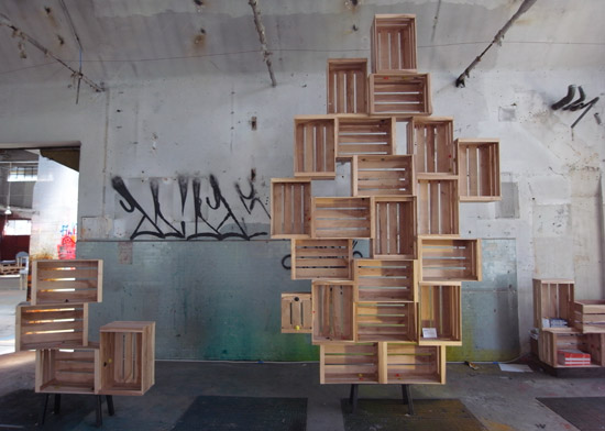
Twist and Lock by Harry Thaler
The whole concept is really simple, and you can do infinite things with it. The crates used in the pictures are special ones but you could translate this into regular crates in some similar way and also get funky results.
'twist & lock' by harry thaler is a system that allows the user to lock special crates together
in order to create different combinations according to the desired needs. users can apply
the system in different ways, for instance, as a book or wine shelf.
in order to create different combinations according to the desired needs. users can apply
the system in different ways, for instance, as a book or wine shelf.


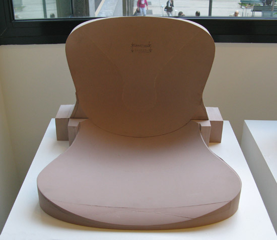
NAP by Kasper Salto
A chair made of pure nylon (polyamide-PA6). It's a simple good design that is also very slim and made with few parts. There is a picture of the vacuum suction mould which is interesting to see (I am obviously not in the field...) and a seating sample made to test basic geometries. The company that is going to sell the chairs is Fritz Hansen.
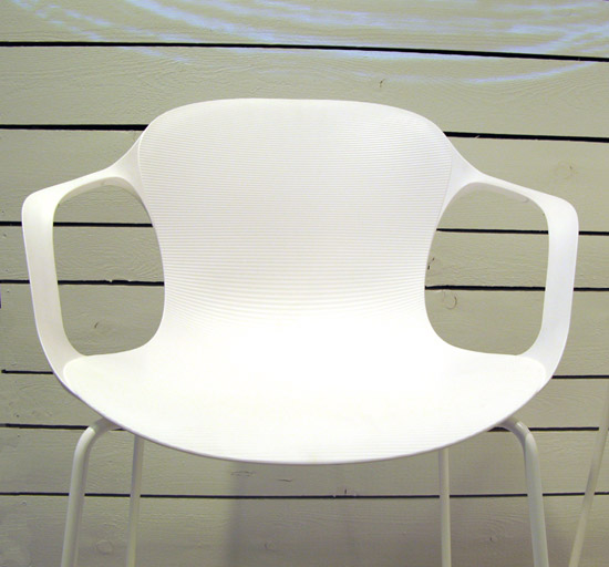


Kasper Salto
Kasper Salto
So you need a typeface by Julian Hansen
Nice job on this one... We are always looking for the best typography to use in each project, and this could be a simplified solution to the problem depending in our needs. Check her portfolio too: Julian Hansen

When Copyright Goes Bad
The debate is a hot spot since some years back... And there are some really unfair actions going on. So I am just dropping you this info:
Electronic Frontier Foundation
Electronic Frontier Foundation
Wednesday, April 21, 2010
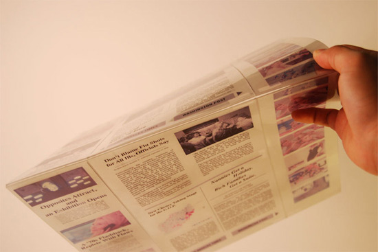
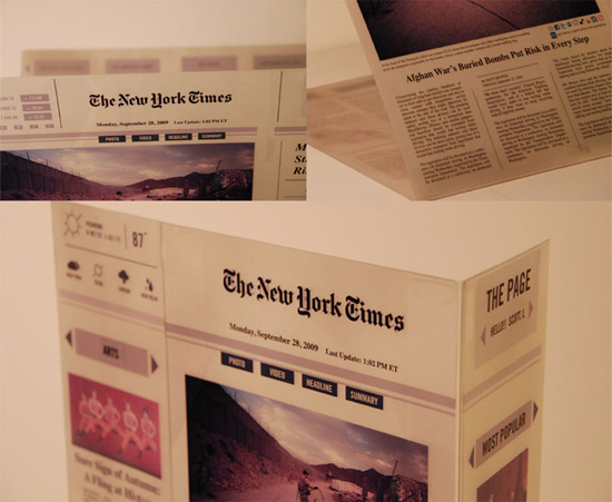
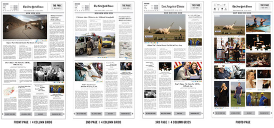
The Page by Jae Kim
As you can watch on the video below this is just a prototype (semi transparent e-ink) of a newspaper e-reader. The concept seems bold and clever to me.
And I am one of those that like to think that color e-ink is the future of print (or not printed really). Sorry for the ipad, which I love (Mac lover and happy user) but for reading e-ink is superior.
The video explains the idea perfectly.
THE PAGE_Adaptive Delivery Device from Scott Liao on Vimeo.


Cooperjay
And I am one of those that like to think that color e-ink is the future of print (or not printed really). Sorry for the ipad, which I love (Mac lover and happy user) but for reading e-ink is superior.
The video explains the idea perfectly.
THE PAGE_Adaptive Delivery Device from Scott Liao on Vimeo.
Cooperjay
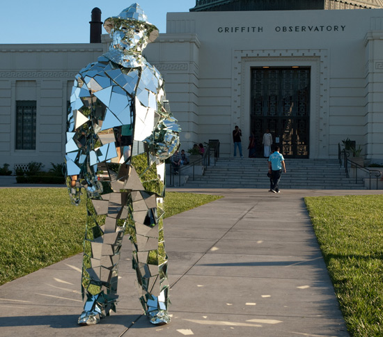
Mirror Man
I know this post its absurd. But its fun to see someone dress like a reflective mirror sculpture...


Subscribe to:
Posts (Atom)

